

Client: Mookie Toys/TP Toys
Role: Lead Coordinator
Disciplines: Industrial Design, Project Management, Factory Liaising, Business Research, Branding.
Year: 2023


The Owl & Fox series marked my third year at TP Toys.
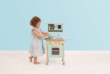
This series of products featured under TP Toys aims to compliment the successful Active-Tots range, by providing Nursery and Roleplay items that could “bookend” play within that age range; with everything from Shape-Sorters and Building Blocks at the very young end, to larger Wooden Kitchens and Workbenches as children got older.
As Product Lead on this range, I had the pleasure of working alongside our Senior Graphics Designer to marry the physical and graphical elements of these products, creating a consistent messaging across all of the new items, and delivering the project to completion.
The Owl & Fox 2023 range consists of 14 Products, these can be catagorised into Nursery, or Roleplay items: the former group was designed to suit ages prior to using Active-Tots, and the Roleplay items favoured those just growing out of the Active-Tots range.
This gave a complete timeline of products from birth all the way into mainline outdoor TP products.


When creating the brand-identity for the range, we were keenly aware of just how saturated this market is, and how the current market tended to favour more muted tones, palletes, and iconography in their ranges.
We felt that by adding both a more vibrant colour separation and characters that symbolised the type of play the children would be engaged with, we were able to create something both distinctive, and more in keeping with our own mainline TP range; whilst still being able to fit within an interior setting. The brighter coral-reds were often used to signify touchpoints and draw the eye, whereas the teal was commonly used in conjunction with the wooden-frame elements, in order to provide a common product theme whilst leaving room to experiment given the varied nature of the products.
Owing to the usual industry seasonal-pressures, the project had a sharp-turnaround and the graphics-team were instrumental in pulling together the incredible brand guidelines and concepts that ended up in the final products.
_PNG.png)
Between the iconography, the colours, brand strategy, photography, packaging and much much more, the team were able to deliver something that truly stands out on the market; in so doing providing the perfect entry-point for potential TP customers, whilst leaving enough space to allow the child to naturally progress into ActiveTots and eventually mainline TP products seamlessly. There’s plenty more to come from this brand, but I am pleased with how it has debuted.
_PNG.png)


